The latest MacOS has all these cool fonts built-in. It's like someone spent $$$ on font licenses for you. Strangely Apple didn't announce this, and you need to go to extra trouble to load them. Quick explainer here.
So I went to the trouble, and loaded Domaine, Produkt, Canela, and Proxima Nova. While I was at it, I got some advice on good writer's fonts in this Reddit thread (here’s a polished survey of actual writers). Garamond isn't available on Mac, but the others are, if you search for them (google: [font name] for Mac).
So I created a new Collection in my Font Book app, called Writing, and stocked it with candidates.
Note that this is about fonts for writing, not for printing or publication. If you're still caught in the 1980's word processing model of composing in whatever font and app will represent the final output, see the "Stop Using Word Processors" section of this posting to unchain yourself from unnecessary constraint.
- Arial
- Avenir
- Baskerville
- Bembo
- Bodoni
- Calibri
- Cochin
- Courier Prime
- Georgia
- and Times New Roman
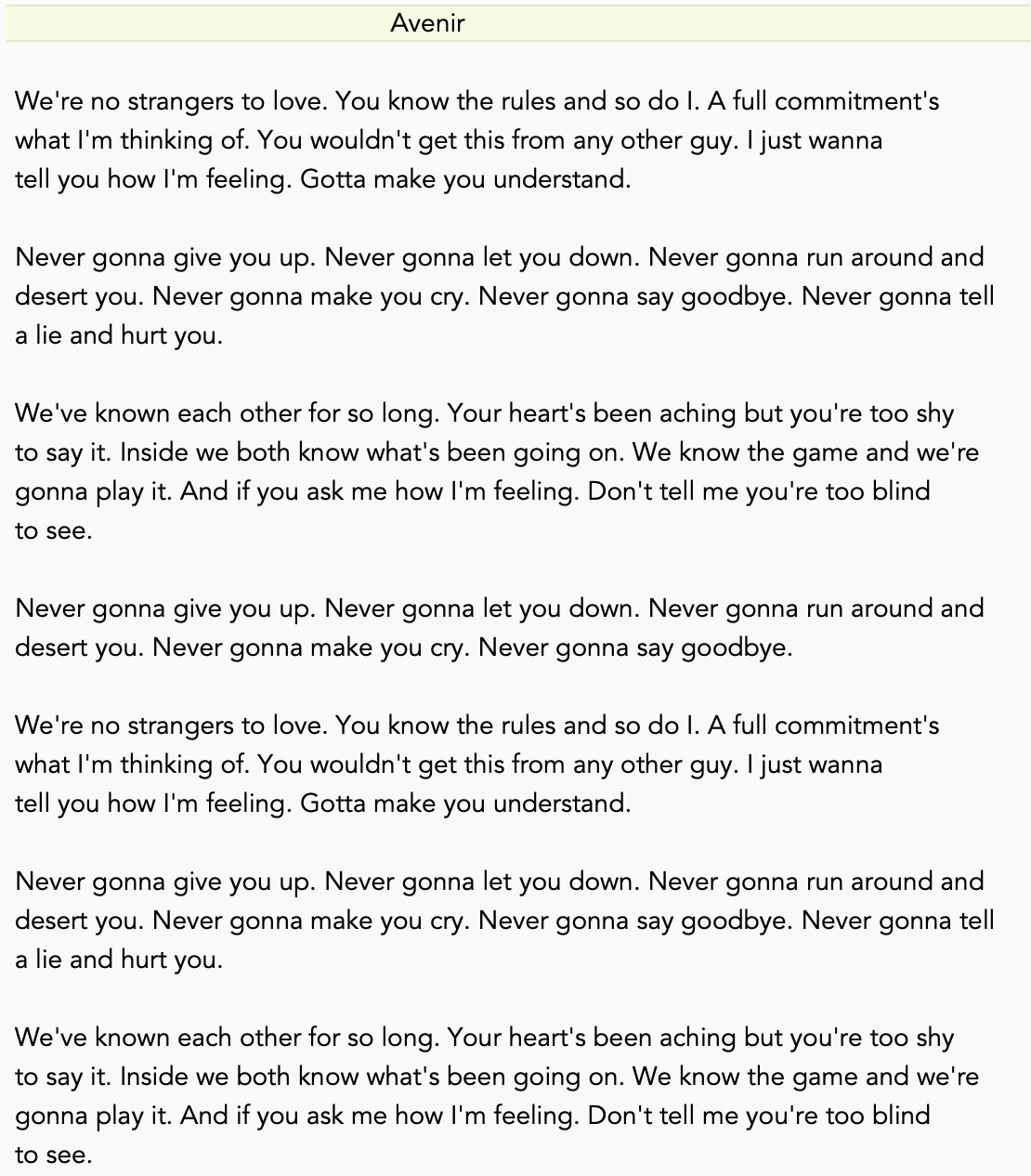
Avenir: Squat and slightly wispy.I also tried Domaine, Produkt, Canela, and Proxima Nova. Like the above, these are all exquisite-looking fonts, and would be nice to read in, and to use for certain end results. But not to write in.
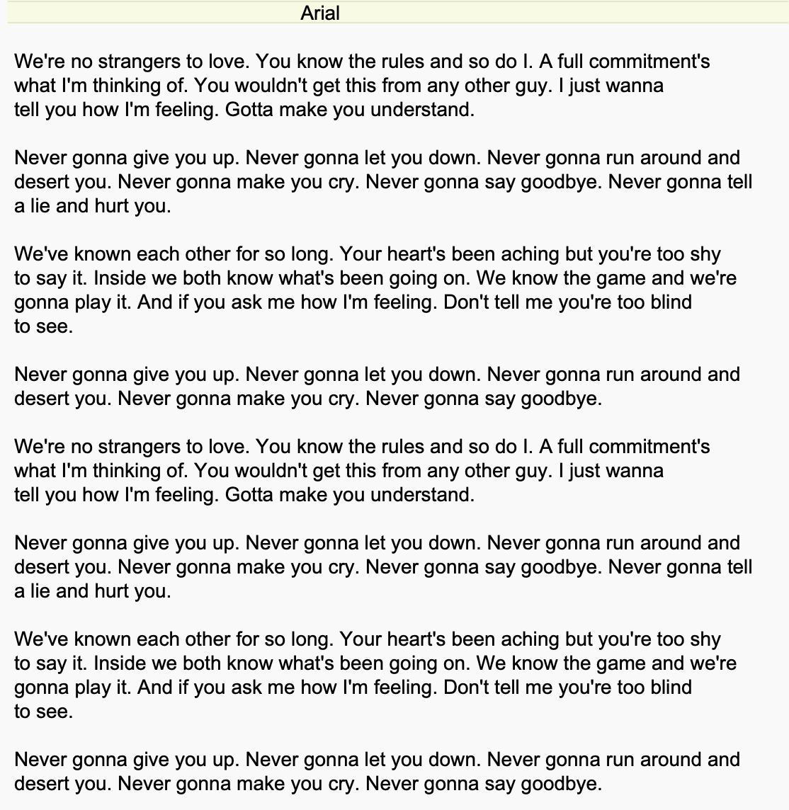
Arial: The store brand version of Avenir.
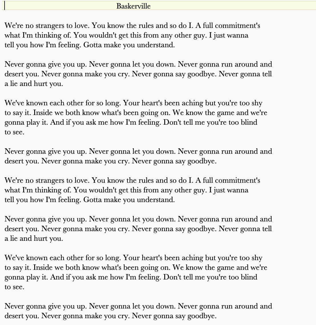
Baskerville: Busy and dense.
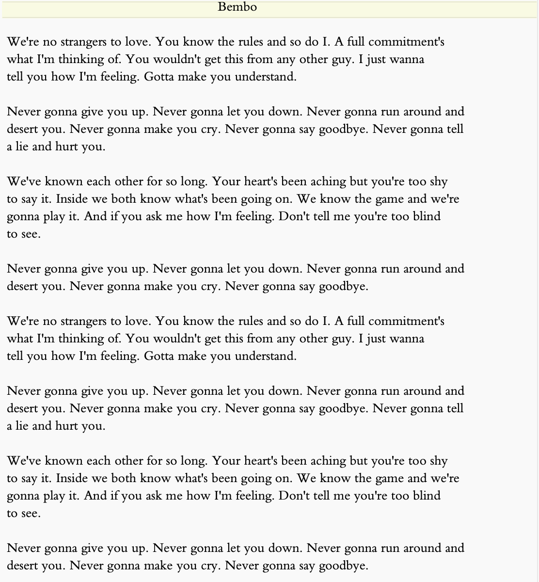
Bembo: Slightly less busy and dense, but still pretty busy and dense.
Bodoni: Exactly the same as Bembo; what's up with that?
Calibri: Is screen space so expensive that everything needs to be squashed together horizontally?
Cochin: Are you trying to give yourself a migraine?
Courier Prime: Just no (unless you're a screenwriter).
Georgia: Spiders nesting in your monitor.
NewTimes Roman: Comfortingly familiar but would you really want to land your cursor between those intricate characters hundreds or thousands of times per day?
The Optima I've always used seems perfect. You'll say that's 'cuz I'm used to it. But I honestly don't think so.
Optima, FYI, is Latin for "best". It's right there in the name.
Followup for PC users (and further discussion of the obsolescence of word processors) here.
No comments:
Post a Comment